Cross-Sectional Survey Designs
Notes for Chapter 3 of Causal Inference with Survey Data on LinkedIn Learning, given by Franz Buscha. I’m using this series of posts to take some notes.
import graphviz as gr
def draw_causal_graph(
    edge_list, node_props=None, edge_props=None, graph_direction="UD"
):
    """Utility to draw a causal (directed) graph
    Taken from: https://github.com/dustinstansbury/statistical-rethinking-2023/blob/a0f4f2d15a06b33355cf3065597dcb43ef829991/utils.py#L52-L66

    """
    g = gr.Digraph(graph_attr={"rankdir": graph_direction})

    edge_props = {} if edge_props is None else edge_props
    for e in edge_list:
        props = edge_props[e] if e in edge_props else {}
        g.edge(e[0], e[1], **props)

    if node_props is not None:
        for name, props in node_props.items():
            g.node(name=name, **props)
    return g
Cross-sectional survey designs
- It’s a snapshot in time, capturing information from many subjects.
- Most common type of survey.
Examples
- Census surveys. Provides a snapshot of a country’s population (e.g. US Census done every 10 years).
- Expenditure surveys. Information on buying habits (e.g. annual Consumer Expenditure Survey).
- Labor force surveys. Collect data on employment (e.g. UK Labour Force Survey, conducted quarterly).
Advantages
- Availability
- Cheap to conduct
- Versatility in topics
Disadvantages
- Lack temporal data
- Sampling, selection, and response bias
- Lack of depth (limited data on complex issues)
Statistical Framework
- A key to working with cross-sectional data is the $i$ subscript, such as in the form:
- The $i$ denotes different observations in the data (e.g. subjects or entities at a single point in time)
Conclusion
- Broad application and more themes.
- Explanatory variables must be used in innovative ways for cause-and-effect analysis.
Regression analysis
- A fundamental statistical method
- A powerful tool for controlling observable factors
- Mainstay of causal analysis
DAG: Controlling for Observable Factors
- A regression model can answer this question: What is the causal effect of X on Y?
draw_causal_graph(
    edge_list=[("X1i", "Yi"), ("ε", "Yi")],
    edge_props={("ε", "Yi"): {"style": "dashed", "label": "β"}},
    graph_direction="LR",
)

Other factors that are not seen in the survey data are summed up in the hidden error term.
$ Y_i = \beta_0 + \beta_1X1_i + \epsilon_i $
- Regression can control for many observable factors
- Effects estimated in a regression model are independent of other effects in the model
- Causal infrence relies on there being no confounders (exogeneity assumption)
- Variables that don’t gice a choice are often exogenous (sex, age, parents birthplace, etc.). These are variables that are “hard to influence”.
- Assumption of exogeneity can be difficult. There can be many factors that drive both Y and X1. This creates a backdoor pathway.
# `ε` is unicode for epsilon since `ε` fails to render
draw_causal_graph(
    edge_list=[("X1i", "Yi"), ("ε", "Yi"), ("ε", "X1i")],
    edge_props={
        ("X1i", "Yi"): {"label": "β1"},
        ("ε", "Yi"): {"style": "dashed"},
        ("ε", "X1i"): {"style": "dashed", "label": "backdoor"},
    },
    graph_direction="LR",
)

If the backdoor is present, then the estimate of $\beta_1$ will not be correct.
But imagine that $X2i$ in the error term can be observed. A new DAG might look like this.
draw_causal_graph(
    edge_list=[("X1i", "Yi"), ("ε", "Yi"), ("X2i", "X1i"), ("X2i", "Yi")],
    edge_props={
        ("X1i", "Yi"): {"label": "β1"},
        ("X2i", "Yi"): {"label": "β2"},
        ("ε", "Yi"): {"style": "dashed"},
        ("ε", "X1i"): {"style": "dashed", "label": "backdoor"},
    },
    graph_direction="LR",
)

$ Y_i = \beta_0 + \beta_1X1_i + \beta_2X2_i + \epsilon_i $
$X2$ is now specifically controlled for.
Triangular Tables: A way to observe the effect on a regression model of incrementally adding more variables but be careful of overfitting. Knowing what variables to include requires some domain knowledge.
Advantages
- Flexibility in variables
- Many different forms for different data
- Easy to understand
Disadvantages
- Often too simple
- Cannot control for unobserved confounders
Conclusion
- Don’t dismiss basic regression
- Underpins more complex models
- Works well with large surveys and many variables
Propensity score matching
Introduction
- Matching designs achieve causal inference by pairing similar data units.
- They don’t require functional form assumptions of normal regression models.
- In normal regression models, coefficients are assumed to be linear. But for something like an age-variable where trends can reverse with old age, this wouldn’t be accurate. Sometimes you can address this in a regression model (e.g. spline?) but needs to be done manually and needs to be correct.
- Matching designs overcome this by not needing functional form assumptions.
How does matching work?
- Imagine you want to know the causal effect of a training program on productivity. In an ideal world, you’d have parallel universes where the exact same person is observed with and without the training.
- But with survey data, imagine there are two people who share similar characteristics (age, gender, etc.) except for whether they got training.
- Take the difference in the outcome variable (productivity). Repeat for all possible pairs.
- Take average of all these differences and that’s the causal effect based on matching.
- Major advantage of this method: all these micro-comparisons don’t require any complex modeling.
Matching assumptions (need both)
- Conditional independence assumption (CIA)
- Once you control for relevant observed variables, the assignment to the treatment group is as good as random.
- No unobserved confounders! Can’t have unobserved variables that drive both outcome and treatment.
- Common support assumption (CSA)
- There must be enough appropriate control observations to match wtih.
- There must be substantial overlap in the distributions of the matching variables comparing the treated and control observations.
Propensity score matching
- Exact matching is when units are paired exactly.
- It’s simple but likely reduces dataset a lot. Also leads to the curse of dimensionality.
- You can match on probability of receiving treatment instead. This is called propensity score matching which is the most common type of matching.
How to propensity score match
- Model probability of treatment using logit or probit regression with independent variables that you believe influence treatment and outcome.
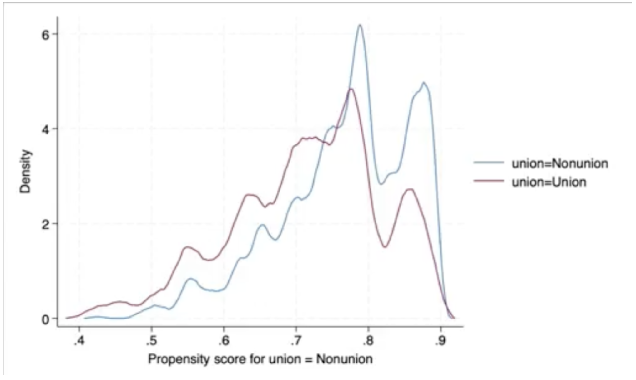
- Predict each unit’s probability of treatment (e.g. compare the propensity score distribution support between treatments and make sure they’re not radically different).
- Use a matching algorithm to match units. K-nearest neighbors is the most common algorithm.
- Assess the covariate balance between treated and untreated control groups. Make sure there’s not a heavy bias. Check that matched differences all go towards zero.
- Compare the outcome variable across the matched pairs.
Advantages
- More flexible than regression
- Simpler interpretation
Disadvantages
- Relies on observable covariates (unobservable covariates can’t be helped)
- Matching quality depends on data
Conclusion
- Attractive alternative to standard regression
- Relatively easy to impelement and explain
- Requires high-quality data
Regression discontinuity designs
Introduction
- Exploits a cutoff in the assignment of treatment
- Uses naturally occurring thresholds
- Very useful for policy analysis
Visual technique
- RDD is a very visual technique
- Much of the math is related to curves are fitted on a graph
- Easy to explain
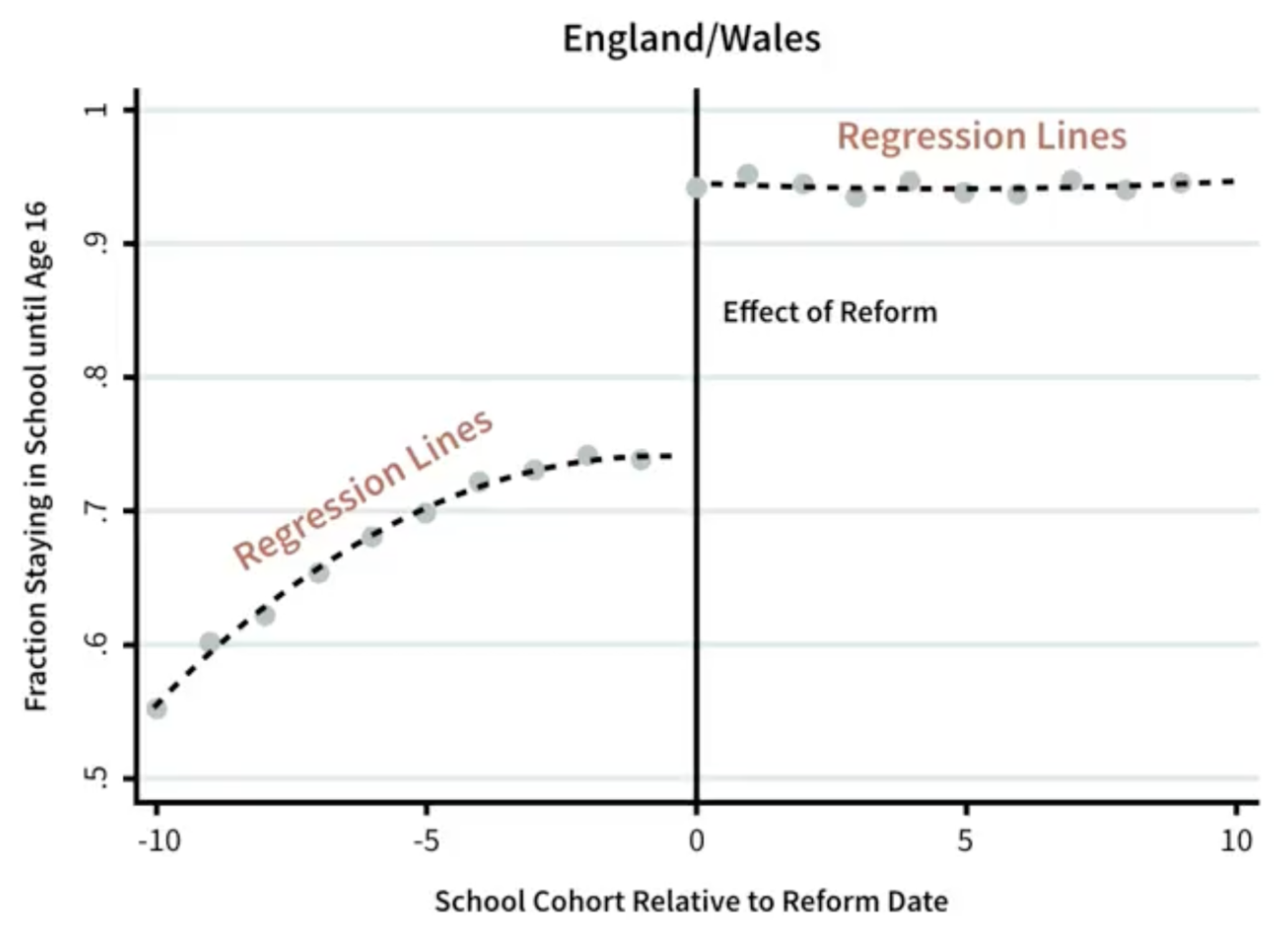
Example: raising of the school leaving age (1972)
- School leaving age increased from 15 to 16
- Reform led to a signficant increase in percentage of kids staying in school (the discontinuity observed before and after reform date)
- Researcher finds the gap between the regression lines before and after the reform
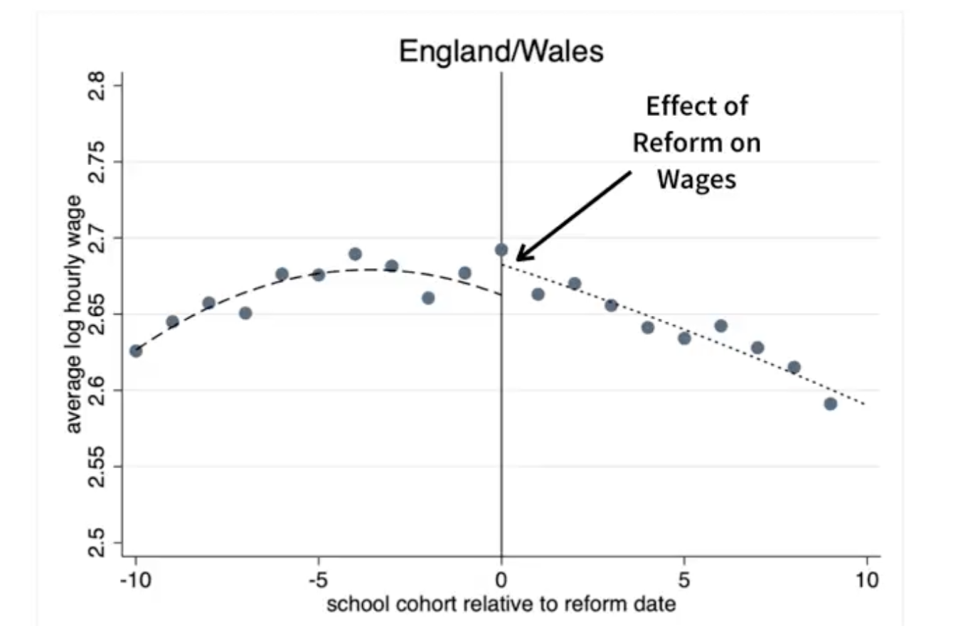
Then what? How do you use discontinuity if you find one? Look another outcome.
- How are average wages changed with more schooling? He sees a positive causal effect on wages.
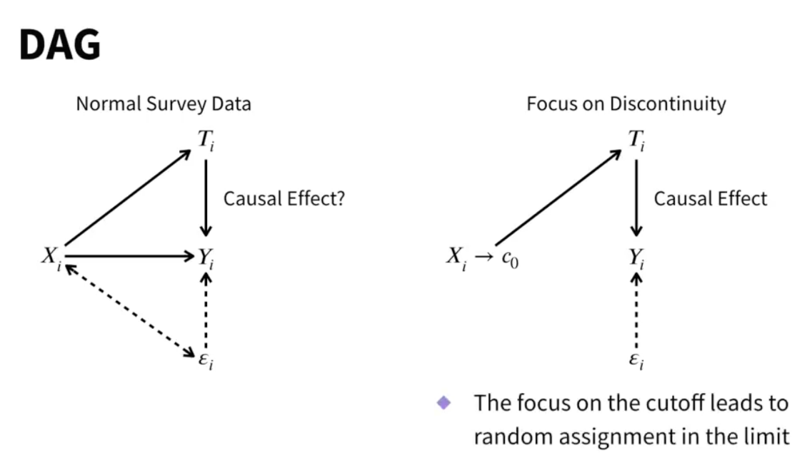
Why causal?
- Placement near discontinuity is random
- Being born just before a reform is random
- Earning just below benefit threshold is random
- RDD can eliminate selection bias into treatments
- It eliminates backdoor paths
- The focus on the cutoff leads to random assignment on just either side of the discontinuity
How to perfom RDD?
- Identify running variable X and natural cut-point (test scores, time of policy interventions, etc.)
- Use visual and statistical tests to see if discontinuity actually exists (is there a gap in the data)
- Identify a suitable outcome variable Y that you’re interested in
- Plot Y against X and examine the effect at the discontinuity (parametric vs. non-parametric). Estimate the treatment effect by plotting the difference in Y for either side of the discontinuity. Use parametric methods if you want to control for covariates and may not have a lot of data, or parametric if there’s a lot of data but don’t want to impose functional form.
Example: election You can also run multiple RDD lines.
Advantages
- Strong causal inference
- Simple and visual
Disadvantages
- Generlizability, only applies in vinity of discontinuity
- Many RDD designs are fuzzy, there might be a gradual change instead of a sharp one. That means it’s a local average treatment effect (LATE), again limiting generalizability.
- Requires large, high-quality surveys
- Sensitive to specifications
Conclusion
- RDD is simple and attractive
- Relies on finding jumps in data
- If they don’t exist, find another method.
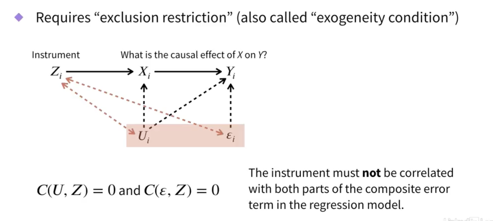
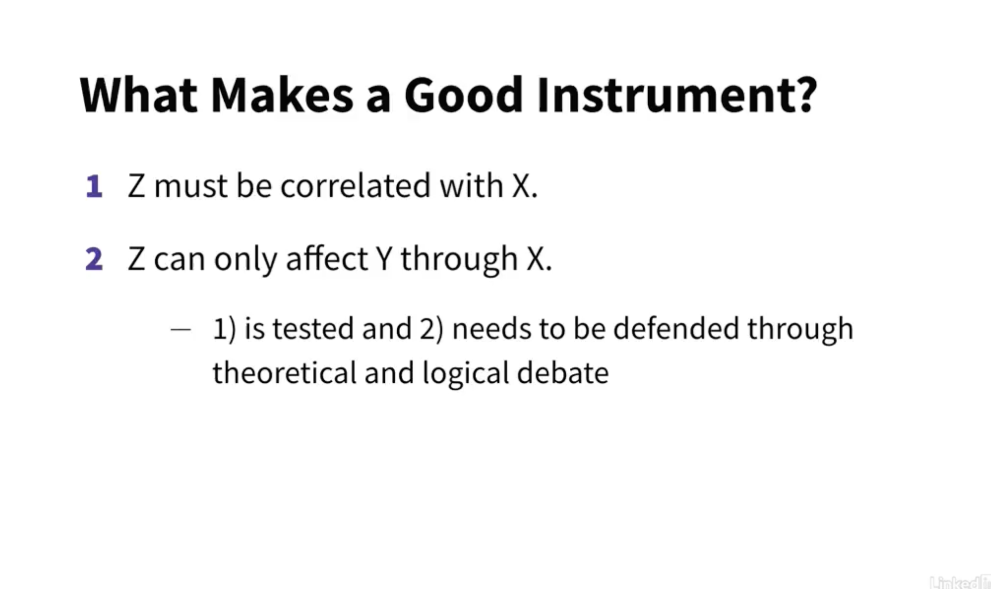
Instrumental variables
- Helps causal inference
- Approach requires “instrument”
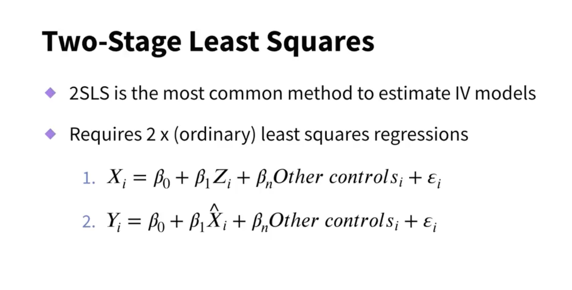
Use the predicted X variable in the second equation, not the actual X variable.
It’s tricky to do this manually since some correction needs to take place.
Always use a dedicated program.
Examples of instruments in studies:
- distance to college
- lottery wins
- quarter of birth
- rainfall
- military draft lottery numbers
Advantages
- Identifies causal effect
Disadvantages
- Relies on having a good instrument (and good data quality to have an instrument)
- Applicable to local average treatment effect (only applicable to subset of individuals)
Conclusion
- Important causal technique for cross-sectional survey data
- Everything hinges on the instrument defense
- Not always possible, you may need to use other methods
%load_ext watermark
%watermark -n -u -v -iv -w
Last updated: Fri May 24 2024

Python implementation: CPython
Python version       : 3.11.7
IPython version      : 8.21.0

graphviz: 0.20.1

Watermark: 2.4.3