Correlated data, different DAGs
One of the lessons from Statistical Rethinking that really hit home for me was the importance of considering the data generation process. Different datasets can show similar patterns, but the data generation can be different. I’ll illustrate this below, showing how correlated data can arise from these varying processes.
As an homage to someone who’s recently been in the news … LFG!
import arviz as az
import daft
from causalgraphicalmodels import CausalGraphicalModel
import matplotlib.pyplot as plt
import numpy as np
import pandas as pd
import scipy.stats as stats
import seaborn as sns
%load_ext nb_black
%config InlineBackend.figure_format = 'retina'
%load_ext watermark
RANDOM_SEED = 8927
np.random.seed(RANDOM_SEED)
az.style.use("arviz-darkgrid")
az.rcParams["stats.hdi_prob"] = 0.89  # sets default credible interval used by arviz
We’ll have three different directed acyclic graphs (DAGs) showing relationships with only three variables, named X, Y, and Z. In all of them, we’ll have 100 datapoints. In all of them, X will be our “predictor” variable and Y will always be the “outcome” variable. Z will be the wild card, moving around so we will see what effects it has on the relationship between X and Y.
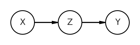
Pipe
The first will be a mediator, AKA a pipe. Here Z passes on information from X to Y.
dag = CausalGraphicalModel(
    nodes=["X", "Y", "Z"],
    edges=[
        ("X", "Z"),
        ("Z", "Y"),
    ],
)
pgm = daft.PGM()
coordinates = {
    "X": (0, 0),
    "Z": (1, 0),
    "Y": (2, 0),
}
for node in dag.dag.nodes:
    pgm.add_node(node, node, *coordinates[node])
for edge in dag.dag.edges:
    pgm.add_edge(*edge)

pgm.render()
<matplotlib.axes._axes.Axes at 0x7fe709497550>
When I say “data generation”, I literally mean that. We can simulate the relationships between all variables. Since X is a starting point, that is the easiest to get. We’ll simply take 100 random samples from a normal distribution with mean 0, standard deviation of 1 (represented in stats.norm.rvs as loc and scale, respectively). Then to generate Z, we’ll take another random samples, where the mean of this new normal distribution is the product of a coefficient bXZ and X. We’re drawing Z from a normal distribution, because a simple multiplication would give perfectly correlated data. That’s not what we’re trying to represent. We then do something similar with Y, expect this time it is the product of bZY and Z.
A few quick notes you may be wondering about: my assignment of value to the coefficients is arbitrary and I’m appending “p” to the variable names, like Xp, to represent the X variable in this pipe dag.
n = 100

# pipe   X > Z > Y
bXZ = 1
bZY = 1

Xp = stats.norm.rvs(loc=0, scale=1, size=n)
Zp = stats.norm.rvs(loc=bXZ*Xp, scale=1, size=n)
Yp = stats.norm.rvs(loc=bZY*Zp, scale=1, size=n)
We’ll plot the relationship of X and Y from this pipe at the end, after we generate all data examples.
Fork
Let’s look at the second DAG, which is a fork. Z influences both X and Y.
dag = CausalGraphicalModel(
    nodes=["X", "Y", "Z"],
    edges=[
        ("Z", "X"),
        ("Z", "Y"),
    ],
)
pgm = daft.PGM()
coordinates = {
    "X": (0, 0),
    "Z": (1, 1),
    "Y": (2, 0),
}
for node in dag.dag.nodes:
    pgm.add_node(node, node, *coordinates[node])
for edge in dag.dag.edges:
    pgm.add_edge(*edge)

pgm.render()
<matplotlib.axes._axes.Axes at 0x7fe6c9853eb0>


/Users/blacar/opt/anaconda3/envs/stats_rethinking/lib/python3.8/site-packages/IPython/core/pylabtools.py:132: UserWarning: Calling figure.constrained_layout, but figure not setup to do constrained layout.  You either called GridSpec without the fig keyword, you are using plt.subplot, or you need to call figure or subplots with the constrained_layout=True kwarg.
  fig.canvas.print_figure(bytes_io, **kw)
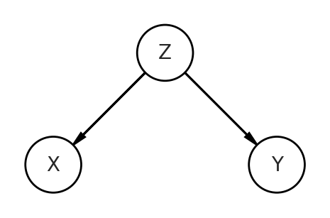
The code will look similar as the pipe, but the relationships of the data generation process will reflect the DAG depicting this fork. You can see how Z is influencing both the predictor X and the outcome Y. Z is a confound of this relationship.
# fork   X < Z > Y
bZX = 1
bZY = 1

Zf = stats.norm.rvs(size=n)
Xf = stats.norm.rvs(bZX*Zf, size=n)
Yf = stats.norm.rvs(bZY*Zf, size=n)
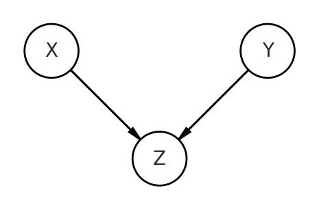
Collider
Now let’s move onto the trickiest DAG, which is the collider. Here, our predictor and outcome variables are no longer the consequences of Z, but are now the causes of Z. They both influence and “collide” on Z.
dag = CausalGraphicalModel(
    nodes=["X", "Y", "Z"],
    edges=[
        ("X", "Z"),
        ("Y", "Z"),
    ],
)
pgm = daft.PGM()
coordinates = {
    "X": (0, 1),
    "Z": (1, 0),
    "Y": (2, 1),
}
for node in dag.dag.nodes:
    pgm.add_node(node, node, *coordinates[node])
for edge in dag.dag.edges:
    pgm.add_edge(*edge)

pgm.render()
<matplotlib.axes._axes.Axes at 0x7fe6681ed070>
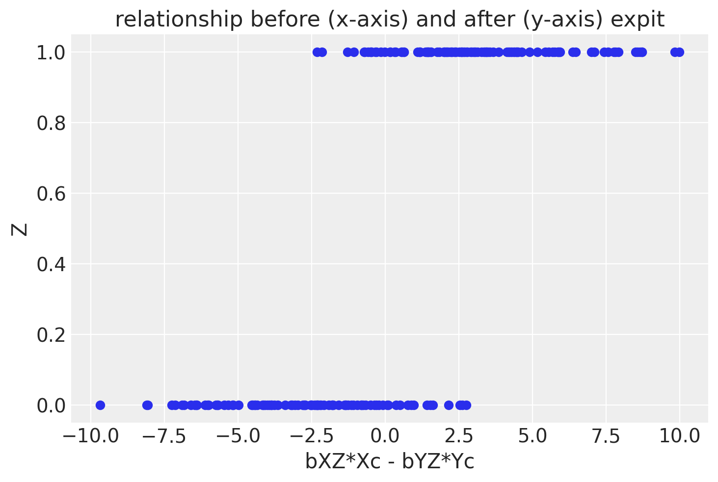
To get correlated data with the collider, we’ll have to do some non-intuitive things that are still represented on this DAG. I’ll show the code then explain after.
# collider   X > Z < Y
from scipy.special import expit

n=200

bXZ = 2
bYZ = 2

Xc = stats.norm.rvs(loc=0, scale=1.5, size=n)
Yc = stats.norm.rvs(loc=0, scale=1.5, size=n)
Zc = stats.bernoulli.rvs(expit(bXZ*Xc - bYZ*Yc), size=n)

df_c = pd.DataFrame({"Xc":Xc, "Yc":Yc, "Zc":Zc, "Znorm":bXZ*Xc - bYZ*Yc})
df_c0 = df_c[df_c['Zc']==0]
df_c1 = df_c[df_c['Zc']==1]
What are we doing in the code?
- We’re going to make
Ztake on a value of 0 or 1. It is essentially a categorical variable. This is to aid in visualization. - To ensure
Zacts as a collider, we still have to represent the causal influences ofXandY. Z is represented by first taking the differencebXZ*Xc - bYZ*Ycand applying an expit (AKA logistic sigmoid function). We take the difference to get a positive correlated relationship to mimic the pipe and fork examples, but it still is a faithful representation of the DAG. - We’re going to show only one subset of data, those with
Zagain to aid in visualization. - Since we’re subsetting the data, we double the number of observations.
df_c.head()
| Xc | Yc | Zc | Znorm | |
|---|---|---|---|---|
| 0 | 1.517475 | -0.412633 | 1 | 3.860216 |
| 1 | -2.698825 | 0.746912 | 0 | -6.891475 |
| 2 | 2.503817 | 0.868102 | 1 | 3.271430 |
| 3 | -0.241992 | -0.795235 | 1 | 1.106486 |
| 4 | 0.182652 | -2.039822 | 1 | 4.444948 |
f, ax1 = plt.subplots()
ax1.scatter(df_c['Znorm'], df_c['Zc'])
ax1.set(xlabel='bXZ*Xc - bYZ*Yc', ylabel='Z', title='relationship before (x-axis) and after (y-axis) expit')
[Text(0.5, 0, 'bXZ*Xc - bYZ*Yc'),
 Text(0, 0.5, 'Z'),
 Text(0.5, 1.0, 'relationship before (x-axis) and after (y-axis) expit')]
OK, now let’s plot the data!
f, (ax1, ax2, ax3) = plt.subplots(1, 3, figsize=(16, 6), sharex=True, sharey=True)
ax1.scatter(Xp, Yp)
ax1.set(xlabel='X', ylabel='Y', title='pipe, X > Z > Y')

ax2.scatter(Xf, Yf)
ax2.set(xlabel='X', ylabel='Y', title='fork, X < Z > Y')

#ax3.scatter(df_c0['Xc'], df_c0['Yc'], color='gray', label='Z=0')
ax3.scatter(df_c1['Xc'], df_c1['Yc'], color='blue', label='Z=1')
ax3.set(xlabel='X', ylabel='Y', title='collider, X > Z < Y,\n(inverse logit(bXZ*Xc - bYZ*Yc)')
ax3.legend()
<matplotlib.legend.Legend at 0x7fe6c142c4f0>
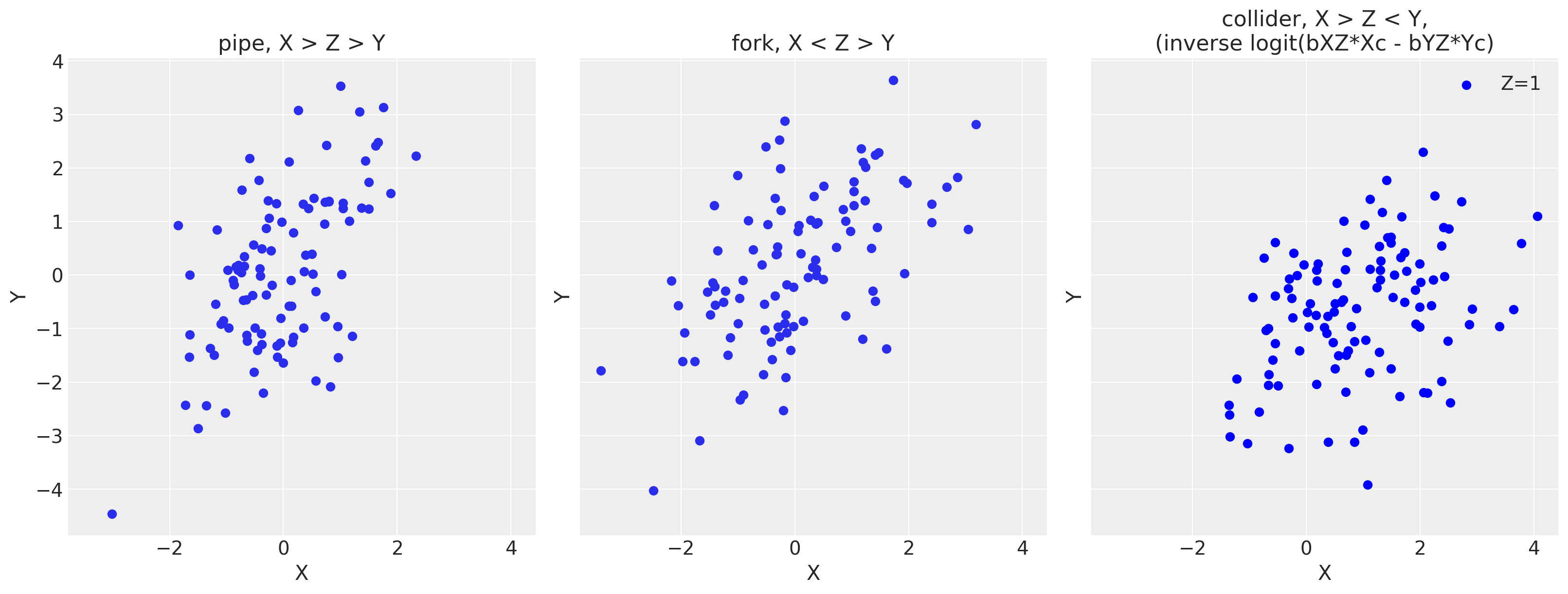
As you can see, there’s a positive correlated relationship despite the DAGs being different and working with only three variables! This drives home the point that we can’t look only at our data to infer the proper relationships. A data generating model is key to know how to stratify our models.
Appendix: Environment and system parameters
%watermark -n -u -v -iv -w
Last updated: Thu Feb 03 2022

Python implementation: CPython
Python version       : 3.8.6
IPython version      : 7.20.0

seaborn    : 0.11.1
numpy      : 1.20.1
pandas     : 1.2.1
arviz      : 0.11.1
daft       : 0.1.0
sys        : 3.8.6 | packaged by conda-forge | (default, Jan 25 2021, 23:22:12)
[Clang 11.0.1 ]
pymc3      : 3.11.0
scipy      : 1.6.0
matplotlib : 3.3.4
statsmodels: 0.12.2

Watermark: 2.1.0